Name of Artist:
Brett Weston
Date of Artist's Life:
December 16, 1911 - January 22, 1993
Personal Background:
He got his education from Edward Weston. He also learned from other well known photographers from his time. He is an american photographer. He was an Author as well as a Photographer. He wrote books such as Fifteen Photographs, and took photographs such as Cracked Paint or Plastic. He won the Guggenheim Fellowship for Creative Arts award.
Style:
His pictures are only in black and white. His pictures are asymmetrical. His photos are close to the subject. A lot of his photos are of nature. He took pictures of leaves more than other things. His photos were cold and distant.
Philosophy:
His images were personal. He insisted that no one else could capture what he did in his images. To prove this point, he burned most of his photographs before he died. His photos expressed the need for attention but with no result. His photos were lonely and expectant.
Influences:
This photographer has influenced my work by showing that photos can still be interesting in black and white. I usually take my photos in color and exaggerated that color. He showed me that with less color you can focus more on detail and values. He showed me that you can be a little farther out and still see lots of detail. I usually like to take the pictures so close that you can only see the texture, so you have to assume what it is.
Sources:
|
Brett Weston's photos:
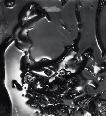
Untitled |
My images:
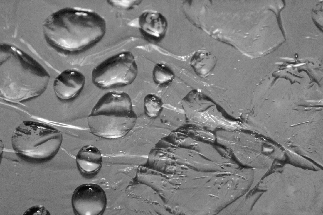
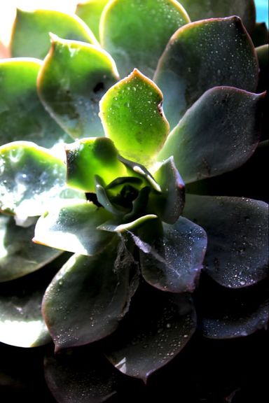
Sit |
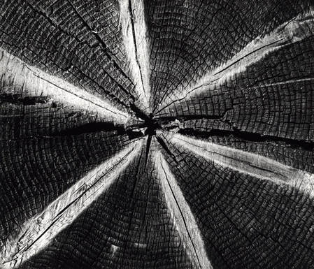
Woodhttp://monovisions.com/wp-content/uploads/2017/03/brett-weston-abstract-photographer-14.jpg
|
Cut Off |
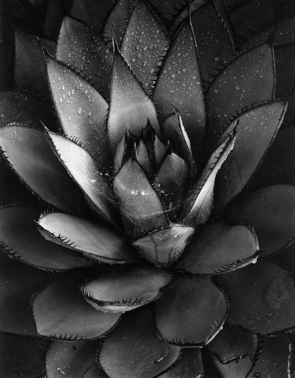
Baja Californiahttp://www.brettwestonarchive.com/sites/default/files/art-pieces/large/century-plant-home-2.jpg
|
Open |
Compare and Contrast:
His water's background had an interesting texture. My background was smooth with a few wrinkles. His back ground was black. My back ground was white. He made his water connected. I left my water as droplets.
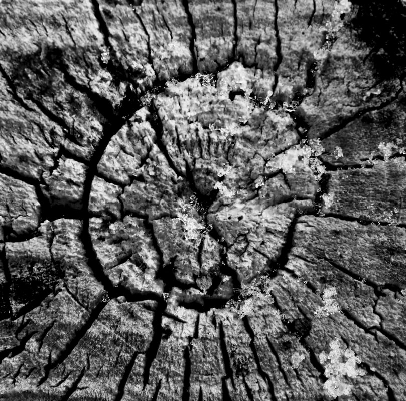
His picture was of a tree stump. My tree stump was actually a branch that got cut. His tree stump has a star shape in it. My tree branch didn't have any ad-normal coloring in it. His tree stump has a crack in it in the middle that extends to the sides. My tree stump doesn't have any big cracks except one circular one around the middle.
The two succulents themselves are different in the sense that his succulent had spikes and mine doesn't. His succulent also has a real spider web that water is resting on. I used a cotton ball that a pulled apart enough to look similar to a spiderweb. His rain drops were probably really. While I used a spray bottle of water to spray the droplets on.
Personal Artist Statment
1. The water:
I placed saran wrap on my smooth white surface. The saran wrap was there to create texture. The saran wrap also gave the water a surface to "stand" on. I used a pipette to place the water drops on the saran wrap. I used the lighting to put light and dimension in the water drops.
2. The cut tree:
The part of a tree I wanted to use for this picture was covered in snow. I cleared most of the snow of but a left a little bit. I liked the extra texture it gave. I liked that the smallest point of the rings was not in the middle of the branch and that it was cut at an angle. It didn't force the eye to the middle of the picture but to the middle of the branch.
3. The succulent:
I chose the succulent picture because I like hoe the water droplets reflect the light. I like that there are contrasting values on the "leaves." I like the uneven pattern of the leaves as well. I chose to use a succulent without thorns to make it look more gentle and inviting. I also chose to make me image color full because it enhanced the beauty of the succulent and its colors. Finally, I chose to change the light sources direction. I liked the gradient of light from the corner better than the light focussing on the middle.
